Phoenix Component guide - reusable building blocks of modern web application


Subscribe to receive Elixir news to your inbox every two weeks.
Expand your skills
Download free e-books, watch expert tech talks, and explore open-source projects. Everything you need to grow as a developer - completely free.
Have you ever thought about making and handling reusable pieces in Phoenix? Or splitting big HTML templates into smaller, easier-to-read parts?
Well, if yes, say hi to Phoenix Component! This functionality makes writing templates kinda like React components, which makes things easier to manage! Let's dive in to meet function components!
Briefly about the Phoenix component
So, what is the Phoenix Component? This is a function component, which, under the hood, is just a simple function. Its argument is a map (called assigns), and the return is rendered struct (to heex extension) created by ~H. This is an Elixir macro, which requires assigns variable - all of the keys of this map are then accessible by their name, with the @ prefix. Function components are building blocks for all of the templates we render in Phoenix. What is worth mentioning is that function components are stateless components.
They can be used either to create reusable HTML elements (such as input, modal, form, and button components) or to divide the HTML template into smaller parts to make it more readable!
Default CoreComponents from Phoenix
The new Phoenix apps come with a new folder, called components, in which we can find the default component module, named core_components.ex. It gives us different components, such as a simple form component, form fields (with different types of inputs), flash message, or modal - with basic documentation examples included. What's more, all of these components can be styled as we wish!
Do you not enjoy the already implemented modal content? Would you like to change its content? Or would you like to change the button class? Feel free to do it! Isn't that awesome? :)
Let's code!
What are we going to create? The idea here is simple - let's create a Card component module!
(We will use a function component for that, and later on, we will describe the difference between function and live components).
Let's start with creating a dedicated module for that
defmodule CuriosumWeb.Card do
  @moduledoc """
  Card component module.
  """

  use CuriosumWeb, :view
  use Phoenix.Component
end
And let's define the basic card function component!
Function component
defmodule CuriosumWeb.Card do
  @moduledoc """
  Card component module.
  """

  use CuriosumWeb, :view
  use Phoenix.Component

  attr :image, :string, required: true, doc: "card image"
  attr :image_alt, :string, required: true, doc: "card image alt"

  attr :description, :string, required: true, doc: "card description, used as information"
  attr :description_title, :string, required: true, doc: "card description"
  attr :actions, :list, default: [], doc: "cards actions, such as `add to favourite`, `dislike`, `share` etc."

  @spec card(Plug.Conn.t()) :: Phoenix.LiveView.Rendered.t()
  def card(assigns) do
    ~H"""
      <div class="card">
        <div class="card__image">
          <img class="card__image" src={@image} alt={@image_alt}>
        </div>
        <div class="card__description">
          <p><strong><%= @description_title %></strong></p>
          <span><%= @description %></span>
        </div>
        <div class="card__actions">
          <p><strong>Actions</strong></p>
          <div class="card__actions-links">
            <p :for={action <- @actions}>
              <.display_icon name={action.name} href={action.href} />
            </p>
          </div>
        </div>
      </div>
    """
  end

  attr :name, :string, required: true, doc: "action name"
  attr :href, :string, required: true, doc: "action link"

  @spec display_icon(Plug.Conn.t() :: Phoenix.LiveView.Rendered.t()
  defp display_icon(%{name: "love"} = assigns) do
    ~H"""
    <a href={@href}><i class="fa fa-heart fa-2x" /></a>
    """
  end

  defp display_icon(%{name: "dislike"} = assigns) do
    ~H"""
    <a href={@href}><i class="fa fa-thumbs-down fa-2x" /></a>
    """
  end
end
So, a few things have happened here! We have just defined our first function component, which is named card and takes an assigns map as an argument. At first sight, we may see attr macro, which is used multiple times. This macro allows us to define used assigns in our component. To define an attribute we need to use the following syntax
attr :field_name, :type_of_fieldThese fields are required when creating a new attr, and the rest of them (default, required, examples, values, and doc) are optional fields - you can find more information about examples in the documentation!
One more attribute that could be used is the global attribute. To implement such an attribute, we just need to create an attr with a global attribute type, for example:
attr :rest, :globalAnd it can be reused on all HTML elements, in a given way:
<p {@rest}><%= @title %></p>The global attribute is a set of HTML tags (list of keywords), which can be used directly on the given element.
Next, we define our function component with its argument, called assigns. The last thing is the body of the component, which is located in ~H (macro to generate and render heex code).
We have also created another function component, which is called display_icon. As you can see, we used one of the elixir expressions (pattern matching), to match the given action by name, and render its link!
The practice here differs a bit from the React approach. In React one file corresponds to one component (we should encapsulate the components). In Phoenix, we do not have such a convention - we can define as many components as we want in one file.
How the card component can be used? It can be embedded e.g. in the heex template with the following syntax
# main page template, index.html.heex

<CuriosumWeb.Card.card
   image={@image}
   image_alt={@image_alt}
   description={@description}
   description_title={@description_title}
   actions={@actions}
/>
We could also shorten component usage, by using alias or import in the view or html.
defmodule CuriosumWeb.MountainsView do
   @moduledoc false
   use CuriosumWeb, :view

   import CuriosumWeb.Card
end
and then use the given card component by a simple call:
# main page template, index.html.heex
<.card
image={@image}
image_alt={@image_alt}
description={@description}
description_title={@description_title}
actions={@actions}
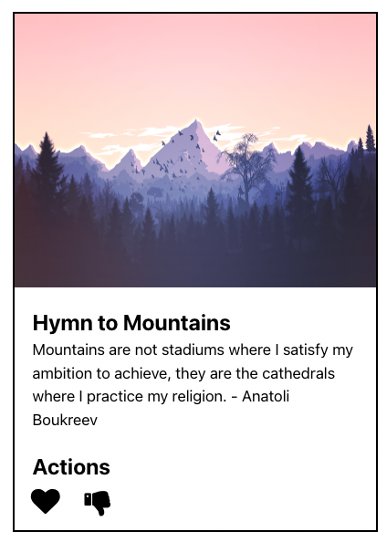
/>Let’s comeback to our example - here are the assigns, that are passed to the function component.
defmodule CuriosumWeb.MountainsController do
  @moduledoc false
  use CuriosumWeb, :controller

  @assigns %{
    image: "https://cdn.pixabay.com/photo/2016/05/24/16/48/mountains-1412683_1280.png",
    image_alt: "Mountains",
    description: "Mountains are not stadiums where I satisfy my ambition to achieve, they are the cathedrals where I practice my religion",
    description_title: "Hymn to Mountains",
    actions: [%{name: "love", href: ~p"/love_image/:image_id"}, %{name: "dislike", href: ~p"/hate_image/:image_id/"}]
  }

  @spec index(Plug.Conn.t(), Plug.Conn.params()) :: Plug.Conn.t()
  def index(conn, _params) do
    render("index.html", @assigns)
  end
end
Assigns established, so that's what our rendered component looks like in the template!
Right now, our Card component can be used from different heex templates, views, or components!
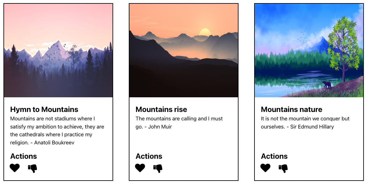
Thanks to this component, we can easily define, e.g., a card gallery with different values!
# main page template, index.html.heex

<div class="mountains__galery">
  <.card
    :for={value <- @values}
    image={value.image}
    image_alt={value.image_alt}
    description={value.description}
    description_title={value.description_title}
    actions={value.actions}
  />
</div>
That's how our gallery looks like in our template!
But what if we would like to change the layout of our component a bit? For example, we could modify the description part! The first thought would be creating a new function component, but there is a better way to achieve our goal - use slot attributes!
Default slot entry
Before defining what slot attributes really are, let's code a bit. Let's adjust our card component
defmodule CuriosumWeb.Card do
  @moduledoc """
  Card component module.
  """

  use CuriosumWeb, :view
  use Phoenix.Component

  attr :image, :string, required: true, doc: "card image"
  attr :image_alt, :string, required: true, doc: "card image alt"

  attr :actions, :list,
    default: [],
    doc: "cards actions, such as `add to favourite`, `dislike`, `share` etc."

  slot :inner_block

  @spec card(Plug.Conn.t()) :: Phoenix.LiveView.Rendered.t()
  def card(assigns) do
    ~H"""
    <div class="card">
      <div class="card__image">
        <img class="card__image" src={@image} alt={@image_alt} />
      </div>
      <%= render_slot(@inner_block) %>
      <div class="card__actions">
        <p><strong>Actions</strong></p>
        <div class="card__actions-links">
          <p :for={action <- @actions}>
            <.display_icon name={action.name} href={action.href} />
          </p>
        </div>
      </div>
    </div>
    """
  end
end
As you can see, we got rid of the description and description title attributes and added the slot attribute. We will use slot entry, called @inner_block, as an argument in the render_slot function. This is our default slot, which allows us to include custom, inner content in our component. How can we define slots slots in our heex template? We just nest it in the component!
# main page template, index.html.heex

<.card image={@image} image_alt={@image_alt} actions={@actions} >
  <div class="card__description">
    <p class="card__description-title"><%= @title %></p>
    <p><%= @restaurant_type %></p>
    <p><%= @restaurant_description %></p>
  </div>
</.card>
We use our component with arguments in a similar way as previously, but inside its' content we define our custom HTML code. And here is the result!
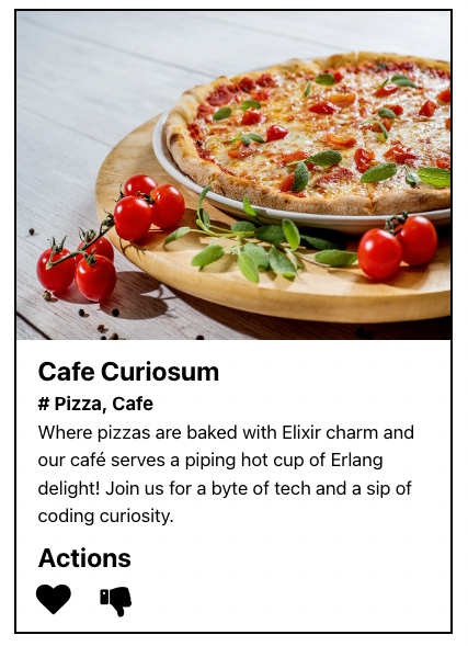
Thanks to our default slot, we are now able to create dynamic descriptions each time! (and thanks to that, create different cards with just one component)
But what if we would like to have still the possibility to use a generic description? Let's use our first example but with little adjustment
defmodule CuriosumWeb.Card do
  @moduledoc """
  Card component module.
  """

  use CuriosumWeb, :view
  use Phoenix.Component

  attr :image, :string, required: true, doc: "card image"
  attr :image_alt, :string, required: true, doc: "card image alt"
  attr :description, :string, default: "", doc: "card description, used as information"
  attr :description_title, :string, default: "", doc: "card description"

  attr :actions, :list,
    default: [],
    doc: "cards actions, such as `add to favorite`, `dislike`, `share` etc."

  slot :inner_block

  @spec card(Plug.Conn.t()) :: Phoenix.LiveView.Rendered.t()
  def card(assigns) do
    ~H"""
    <div class="card">
      <div class="card__image">
        <img class="card__image" src={@image} alt={@image_alt} />
      </div>
        <%= if @inner_block != [] do %>
          <%= render_slot(@inner_block) %>
        <% else %>
          <div class="card__description">
            <p><strong><%= @description_title %></strong></p>
            <span><%= @description %></span>
          </div>
        <% end %>
      <div class="card__actions">
        <p><strong>Actions</strong></p>
        <div class="card__actions-links">
          <p :for={action <- @actions}>
            <.display_icon name={action.name} href={action.href} />
          </p>
        </div>
      </div>
    </div>
    """
  end
end
As you can see, I added back description and description_title to component attributes, and inside the component I added a simple statement, to render either @inner_block or our generic description.
nit: it is better in such cases to check if the list is empty with
@inner_content != [], 'cause it is way faster thanlength(@inner_conent) > 0. It is because,lengthneeds to iterate over whole list, which is more time consuming operation.
So, there may be one more question for now, regarding the slots usage. Can I use many slot attributes?
The answer is yes! Let's implement some named slots. We will create two named slots for our case using our current module. The first will be a description, and the second named slot will be actions.
Custom named slot
Let's first implement a new design to our component, to accept also-named slots.
defmodule CuriosumWeb.Card do
  @moduledoc """
  Card component module.
  """

  use CuriosumWeb, :view
  use Phoenix.Component

  attr :image, :string, required: true, doc: "card image"
  attr :image_alt, :string, required: true, doc: "card image alt"
  attr :description, :string, default: "", doc: "card description, used as information"
  attr :description_title, :string, default: "", doc: "card description"

  attr :actions, :list,
    default: [],
    doc: "cards actions, such as `add to favourite`, `dislike`, `share` etc."

  slot :description_block, doc: "card description"
  slot :actions_block, doc: "actions description"

  @spec card(Plug.Conn.t()) :: Phoenix.LiveView.Rendered.t()
  def card(assigns) do
    ~H"""
    <div class="card">
      <div class="card__image">
        <img class="card__image" src={@image} alt={@image_alt} />
      </div>
      <%= if @description_block != [] do %>
        <%= render_slot(@description_block) %>
      <% else %>
      <.card_description description={@description} description_title={@description_title} />
      <% end %>
      <%= if @actions_block != [] do %>
        <%= render_slot(@actions_block) %>
      <% else %>
        <.card_actions actions={@actions} />
      <% end %>
    </div>
    """
  end
end
Right now, we use two named slots, which are description_block and actions_block (we do not use inner_block, the default slot, because it is no longer used). I did also create two smaller components, cards_description
  attr :description, :string, required: true, doc: "card description, used as information"
  attr :description_title, :string, required: true, doc: "card description"

  @spec card_description(Plug.Conn.t()) :: Phoenix.LiveView.Rendered.t()
  defp card_description(assigns) do
    ~H"""
    <div class="card__description">
      <p><strong><%= @description_title %></strong></p>
      <span><%= @description %></span>
    </div>
    """
  end
and card_actions
  attr :actions, :list, default: []

  @spec card_actions(Plug.Conn.t()) :: Phoenix.LiveView.Rendered.t()
  defp card_actions(assigns) do
    ~H"""
    <div class="card__actions">
      <p><strong>Actions</strong></p>
      <div class="card__actions-links">
        <p :for={action <- @actions}>
          <.display_icon name={action.name} href={action.href} />
        </p>
      </div>
    </div>
    """
  end
Let's now take a look into our code in heex template, to see the rendered code!
# main page template, index.html.heex
<.card image={@image} image_alt={@image_alt} actions={@actions}>
  <:description_block>
    <div class="card__description">
      <p class="card_description-title"><%= @title %></p>
      <p><%= @restaurant_type %></p>
      <p><%= @restaurant_description %></p>
    </div>
  </:description_block>
  <:actions_block>
    <div class="card__actions">
      <a href={action.href} :for={action <- @actions}>
        <CuriosumWeb.CoreComponents.button>
          <%= action.name %>
        </CuriosumWeb.CoreComponents.button>
      </a>
    </div>
  </:actions_block>
</.card>
We use our slots by simply calling each of the named slots by name in a dedicated structure, with their representative content.
Inside slots, we can use other components, such as HTML tags or already created components (such as button components!)
What's worth noticing is that to slots, we may assign another attr macros, which may be used to expand our components.
assign_new
Sometimes, we may need to conditionally change the value of our assign map, or just create a new one. To that, we may use the built-in assign_new function. Let's take a look at our function components to get rendered icon
defmodule CuriosumWeb.Card do
  @moduledoc """
  Card component module.
  """

  use CuriosumWeb, :view
  use Phoenix.Component

  attr :name, :string, required: true, doc: "action name"
  attr :href, :string, required: true, doc: "action link"

  @spec display_icon(Plug.Conn.t()) :: Phoenix.LiveView.Rendered.t()
  defp display_icon(%{name: "love"} = assigns) do
    ~H"""
    <a href={@href}><i class="fa fa-heart fa-2x" /></a>
    """
  end

  defp display_icon(%{name: "dislike"} = assigns) do
    ~H"""
    <a href={@href}><i class="fa fa-thumbs-down fa-2x" /></a>
    """
  end
end
It does not look that bad, but imagine if we would have 20 icons. What we could do is assign the icons to the module attribute and use the assign_new function!
defmodule CuriosumWeb.Card do
  @moduledoc """
  Card component module.
  """

  use CuriosumWeb, :view
  use Phoenix.Component

  @listed_icons %{
    "love" => "fa fa-heart fa-2x",
    "dislike" => "fa fa-thumbs-down fa-2x"
  }

  attr :name, :string, required: true, doc: "action name"
  attr :href, :string, required: true, doc: "action link"

  @spec display_icon(Plug.Conn.t()) :: Phoenix.LiveView.Rendered.t()
  defp display_icon(assigns) do
    assigns = assign_new(assigns, :icon, fn -> @listed_icons[assigns.name] end)

    ~H"""
    <a href={@href}><i class={@icon}/></a>
    """
  end
end
Differences between components
There are three types of components - function component, live component, and LiveView. Let's describe them briefly.
The least things can do function component, which is not the stateful component. It is simply responsible for rendering HTML elements.
Live-related components allow you to perform different actions on the same page without the need to refresh the page.
The main difference between the live component and LiveView (which both, can be either stateful components or stateless components), is that LiveView can create a socket. Also, live components use the parent live view process.
Live components can be used to compartmentalize state, markup, and events, and LiveView can be used to compartmentalize state, markup, events, and error isolation.
(I'm talking about occurrences like form submission, such as when a user submits it.)
The templates in live-related components are rendered via the def render function, which can be inlined HTML code or collected from the templates.
While function components are used to use and manage, the live-related components need more patience and knowledge regarding:
- lifecycle of liveview,
- knowledge of using different data types (assigns vs streams),
- security (especially when using
live_render),
That's just a short introduction to the difference between functional components and live components. Stay tuned for a more exhaustive one!
How to hierarchize component files
First of all - there are no strict rules.
For generic resources, it is a good choice to use the provided Phoenix components folder and extend it with new modules with new function components. For casual function components, it is worth putting them directly in the views (as this is a layer responsible for rendering our data).
For LiveView components, the used template can be either collected (the heex templates and liveview module need to be in the same folder) with corresponding file names or can be inline directly in the module def render function.
Summing up
As it may be seen by this brief introduction, Phoenixs' components give us a lot of new possibilities to structure our rendered structures. The current approach for creating more reusable components comes from the React eco-system. Thanks to that, the HTML code structure may become cleaner and readable. With consistent experience, we may get one source of truth for many components of our app (such as the button component, modal content, or form component). We can also obey the DRY (don't repeat yourself) rule. Creating dedicated components also allows us to keep a single responsibility principle - the component is, and should be, just responsible for its own job. Hope you enjoyed this article!
Happy coding!
Want to power your product with Elixir? We’ve got you covered.
Related posts
Dive deeper into this topic with these related posts
You might also like
Discover more content from this category

While we can't say cheating on anyone is okay, we're not as absolutistic when it comes to cheating on Elixir at times.

Every application contains bugs, and even if it doesn't, it will.

Updates to Permit, Permit.Ecto, Permit.Phoenix and Permit.Absinthe: Igniter setup and plural actions
Here's what changed in Permit 0.4.0, Permit.Ecto 0.3.0, Permit.Phoenix 0.5.0 and Permit.Absinthe 0.3.0.