Improve your component's game with Storybook


The world of front-end development is astonishing; no one doubts it.
Past years only confirm this thesis. A massive blast of front-end technologies like React, React Native, Vue, or Angular meets with outstanding tools like Tailwind, Lottie, or Storybook, which is the hero of this article.
Storybook is probably the most popular interface-related front-end tool. It helps developers, designers, product owners, and even testers cooperate effectively. After reading this article for about 10 minutes, you should understand Storybook's superpowers and how to set it up in your upcoming project.
What is Storybook?
Storybook is a powerful, frontend-related workspace that enhances the experience of documenting, managing, testing, and deploying UI components. It may sound like nothing special, but digging deeper into its core features will quickly reveal how versatile and extraordinary it is.
To hook its potential users even more, Storybook is open about showing its achievements and numbers: almost 23 million monthly installs and more than 2200 contributors to its codebase. The word "impressive" isn't powerful enough to describe this.
What does Storybook offer?
It lets you work on UI components in isolation.
Every developer has had that problem at least once—you want to double-check some component in your implementation, but it's too hard to reach, it isn't easy to test some edge case, or it requires building the whole app.
With Storybook, you can render any UI component in isolation, display it on a clean canvas, manipulate its properties from the Storybook panel, and develop it without building the app after every change. It's a massive boost to any design system development.
It works with any significant front-end technology.
As a world-class product, Storybook supports most of the top front-end technologies, such as React, Vue, Angular, or Next.js. It's also a standalone tool that runs alongside an app with a zero-config environment.
Its versatility doesn't end here because a Storybook can be attached to your codebase anytime, no matter which stage your product is currently in (a fresh one, some code already in place, or an existing developed product).
It supercharges testing UI components.
Testing is always a tough nut to crack and requires time, effort, and some doze of knowledge to make it right. Storybook makes testing UI components easier and enhances the final results with automatic component reviews.
You can use Storybook to catch design/UI mistakes, compare different versions of a single component to find changes, simulate interactive states, or double-check accessibility requirements.
It documents components for your team.
No one likes documentation, whether created, managed, or sometimes even read. With a small portion of the dev effort, Storybook can generate the entire component documentation and maintain it simultaneously with the components in the code; no additional effort is needed.
Storybooks can be viewed locally, but their power comes with deploying them on a webpage so that everyone on a team can launch them on their computers. After that, every teammate can search for any component inside documentation, play around with properties without breaking anything, or reconstruct the documentation scheme if needed!
Until now, it's easy to understand that Storybook is a one-fits-all solution. However, like any other supplementary tool, Storybook requires additional effort to be set up correctly to receive all the quality boosters described above. Is it worth it? You should already know the answer.
How to set up Storybook?
In this article, you can learn how to set up Storybook in a fresh React project, but you should already know that you can do it in almost any front-end technology available in the market. It is worth mentioning that Storybook is entirely free, easily expandable with add-ons and integrations, and is open source.
For the presentation, some React components will already be prepared to test Storybook's power after a successful setup instantly. The reproduction steps may differ from the React ones, so visit the official Storybook documentation for additional support.
First, let’s create a new React project:
npx create-react-app storybook-demoNext, add Storybook to our project (run this inside your project’s root directory):
npx storybook@latest initThis will create 2 folders for you:

Folder 1 — .storybook
- main.js — config file that defines the behavior of your Storybook project, including the location of your stories, the addons, feature flags, and other project-specific settings;
- preview.js — responsible for global code: decorators, parameters, and types that apply to all stories.

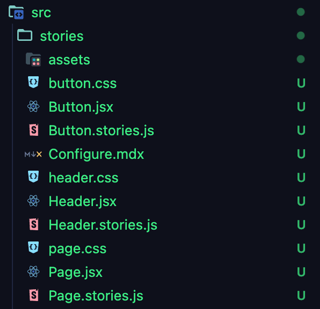
Folder 2 — src / stories
- With a couple of files that represent demo stories for Button and Header components.
Now, you can run Storybook in your browser and test it out live, it should be accessible on http://localhost:6006. To do so, run this command:
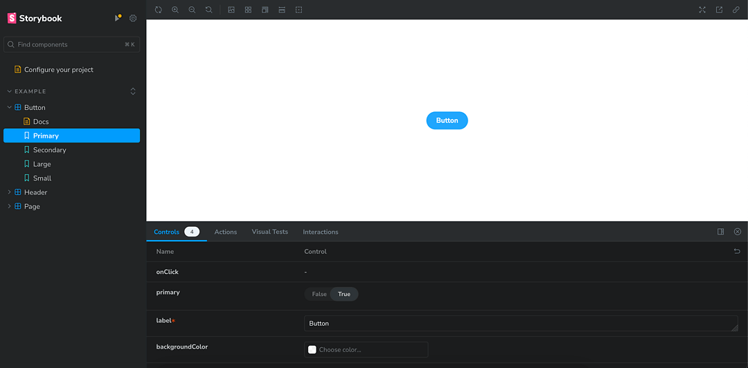
npm run storybookAfter you successfully run a Storybook, you should see an empty setup of the Storybook default homepage. After selecting any of the demo stories and going deeper into its subfolder, you can see how Storybook visualizes components.

The left-side menu consists of:
- Storybook logo, that can be switched to your own one in the future;
- Search bar to quickly bring up what you currently need;
-
List of components available to scout within Storybook;
- Every component (such as “Button”) has sub-files presented below that are called “Stories” (such as “Primary”, “Secondary”, “Large”, “Small”);
The central space consists of:
-
Component render zone where selected component or story renders;
- This space can be further customized with additional frames or integrations;
-
Controls/Properties tables that showcase more info about the component/story, available actions, or even animations;
- Some of the properties listed there are interactive, so you can change the values right inside Storybook to instantly see how the component reacts to them;
How to write your first custom component?
Now, when you have your basic Storybook setup ready, it is the best time to start creating your first custom components and importing them to your Storybook. It doesn’t matter if the component is fresh, created after Storybook setup, or an existing component within your codebase — it is still easy and quick to populate your Storybook with your components.
Firstly, you need to have your component file prepared. The component file doesn’t need any additional lines of code to be consumed by Storybook, so you can keep your code clean. For now, we will use a placeholder component name such as:
component_name.jsxSecondly, you need a storybook file to consume all of the component’s variants and properties. To do so, you just create another file called:
component_name.stories.jsThis file should have a more or less similar structure to the code provided below. You can either start from scratch with the help of Storybook documentation to create this file or use the “Button” or “Header” components that have been generated in our previous chapter during the initial Storybook setup to look for an example implementation.
import { component_name } from './component_name';

export default {
  title: 'folder_name/component_name',
  component: component_name,
  parameters: {
    layout: 'centered',
  },
  tags: ['autodocs'],
  argTypes: {
    //put your component argtypes here
  },
};

export const story_name = {
  args: {
    //put your story arguments here
  },
};
The most important element to pay attention to:
- import { component_name } - import your original component file
- export default - whole section with folder structure, default parameters or predefined arguments for the component
- export const story_name - a more detailed showcase of potential properties of your original component, divided into stories
This is just a short overview, so for a more detailed explanation, head over to Storybook documentation.
Finally, visit your main Storybook page to see that your custom component appeared in your left-side menu with all of the properties you previously set up in the file!
Now, you can continue adding new custom components, creating storybook files for each of them, and starting to build up your Storybook documentation! Of course, it's just the tip of the iceberg of Storybook potential, yet you got your first baby step completed.
To sum this up.
Knowing such a powerful tool and setting it up in minutes in any project is a game changer. I hope this article has provided everything you should know about Storybook and encouraged you to try it.
Bring your web app idea to life with our React experts.
Related posts
Dive deeper into this topic with these related posts
You might also like
Discover more content from this category
In the current fast-moving online development world, React and GraphQL are two of the most powerful technologies that can significantly improve both the efficiency and handling rate of web apps.
Testing is often an overlooked part of the development process, while it's one of the most important. This post shows a few popular approaches to testing React applications.
React 19 introduces some interesting tools that are supposed to make handling forms easier, cleaner and more performant. Let's take a look at them and check whether that's true.


